Hollandazed: Thoughts, Ideas, and Miscellany — cover design
COVER STORY: OPERATION UNTHINKABLE (by Tom Russell)

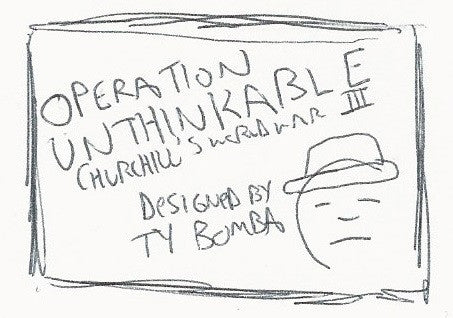
Sometimes, a cover starts with a sketch. (The word sketch is probably being overly generous, given that my drawing skills leave a lot to be desired.) This was the case with Operation Unthinkable. I started by sketching out the cover on a small scrap of paper. A quick sketch, of course, and an imprecise one: the box proportions are roughly there, but are a little too long, and thus a bad approximation of the actual canvas. The text is in my trademark illegible scrawl, and thus it's very irregular and lacks any sense of proportion. Once I select a typeface...
COVER STORY: MORE AGGRESSIVE ATTITUDES (by Tom Russell)

As I've mentioned more than once, Mary is amazing. One of the reasons why she's amazing is that she stops me from doing dumb things. Don't quote me on this, but I'm pretty sure she once had to legitimately stop me from putting aluminum foil in the microwave, and also from wearing Velcro shoes to a professional interview. Recently I thought it was a smart idea to put fennel in twice-baked potatoes, and learned that it wasn't such a smart idea after all when we were eating said potatoes, and also two, three, and four hours later during repeated visits...
COVER STORY: UKRAINIAN CRISIS & THE LITTLE WAR (by Tom Russell)

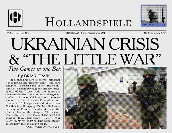
One of the reasons why I started designing box covers for my games was to have more control over the process. There had been a couple of instances in the past where the publisher had saddled my game with an ugly cover or a terrible name or both. One particularly egregious example never made it to market - I guess thankfully in retrospect. I'm not going to pretend like that's the worst thing that ever happened to somebody, or that even the worst thing that ever happened to a designer, but it was still an experience I wanted to avoid....
COVER STORY: PLAN 1919 (by Tom Russell)

I had a pretty good idea about how I would approach the cover for Plan 1919 even before John Gorkowski had designed the game. Part of this is that I had spent several months trying (and failing) to design my own game on the topic before Mary and I asked Mr. Gorkowski to take a whack at it. Which is one of the great things about running a games company: if you want a game to exist on a topic, but can't do it yourself, you can ask someone else whose talents are better suited to that topic. And with...
COVER STORY: AN INFAMOUS TRAFFIC (by Cole Wehrle)

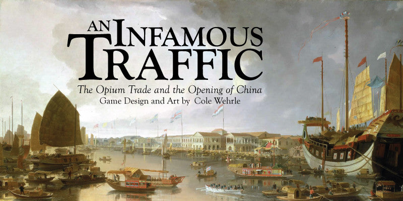
The design of An Infamous Traffic’s cover began with a surprisingly rejection. Mary and Tom had both loved the design of the game. They had loved the look of my playtesting counters, and they had loved the map. They did not, however, liked the cover. What more could they want?! This cover had everything. It had fancy typography and it had a pretty painting. What historical game box could want more? Well, it turns out that they both had strong opinions about covers. Wargame cover design over the past fifteen years or so has followed the Rodger B. MacGowan school...
