Hollandazed: Thoughts, Ideas, and Miscellany — cover design
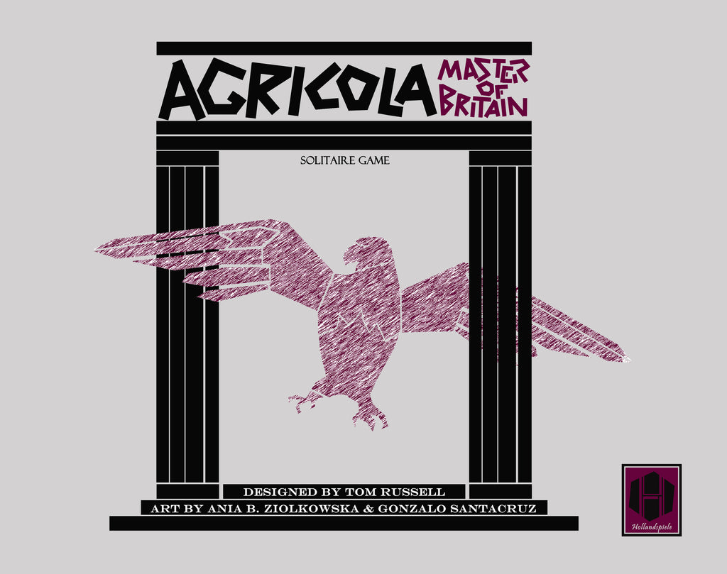
COVER STORY - AGRICOLA, MASTER OF BRITAIN (by Tom Russell)

My first love was the cinema, and so it's probably no surprise that I have a great deal of affection for, and draw a great deal of inspiration from, great movie posters. I'm a big fan of the Polish school, but my favorites, hands-down, are the work of the legendary Saul Bass. Bass is a hugely influential designer-- so much so that there are lots of posters that are so "Bass-like" that you might think Bass did them. Take, for example, the poster that Jouineau Bourduge did for Kubrick's Barry Lyndon: Really, almost everything I try to do in my...
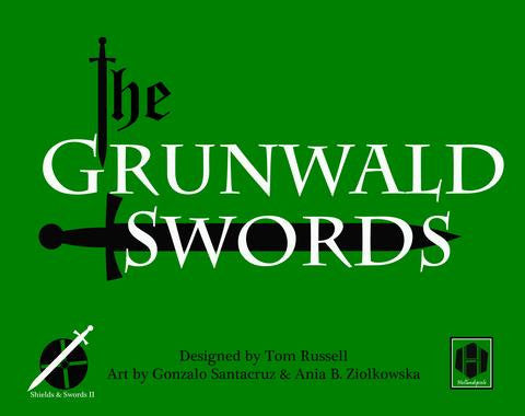
COVER STORY: THE GRUNWALD SWORDS (by Tom Russell)

The Grunwald Swords cover was certainly the easiest one that I ever did, as it went through the fewest iterations. Usually what happens is I'll have an idea for the cover, I'll block it out, and then find that I don't like it. So I'll scrap it for something else that I'll be happy with. Then I show it to Mary, who will give it the yay or the nay. Sometimes this results in me going at it again from scratch. And so on, until I end up with a cover that's half-way presentable. But with this one, I had...
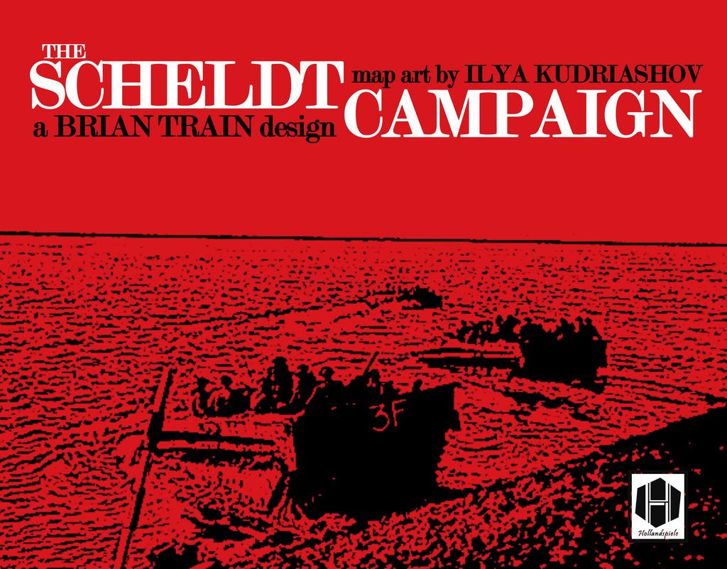
COVER STORY: THE SCHELDT CAMPAIGN (by Tom Russell)

It starts with color, and typography. Whenever I do a box cover, I tend to limit my palette to two or three very stark, bold, direct colors. For The Scheldt Campaign, I started with a bright, rich red (d8161e). This would be the color that dominated the canvas. I then decided to use white as my primary text color. It's clean and reads well on red, without the need for any outline, shading, or drop. I'm not afraid of using those elements when I need to, but I prefer to stay away from then when I can. It gives the...
