Hollandazed: Thoughts, Ideas, and Miscellany — cover design
FROM THE ARCHIVES: COVER STORY: MORE AGGRESSIVE ATTITUDES (by Tom Russell)

As I've mentioned more than once, Mary is amazing. One of the reasons why she's amazing is that she stops me from doing dumb things. Don't quote me on this, but I'm pretty sure she once had to legitimately stop me from putting aluminum foil in the microwave, and also from wearing Velcro shoes to a professional interview. Recently I thought it was a smart idea to put fennel in twice-baked potatoes, and learned that it wasn't such a smart idea after all when we were eating said potatoes, and also two, three, and four hours later during repeated visits...
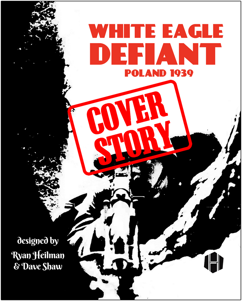
COVER STORY: WHITE EAGLE DEFIANT (by Tom Russell)

White Eagle Defiant is a sequel of sorts to last year's popular introductory wargame Brave Little Belgium. I think that game had one of my better covers. My ideal cover for any game is one that's very simple - almost too simple - but communicates. I've also a strong preference for bold, solid colors that I hope confer a strong sense of visual identity. So, the cover for Brave Little Belgium ticked all my boxes, and I was looking to do something in a similar vein for White Eagle: a simple image defined by solid color. My first instinct was...
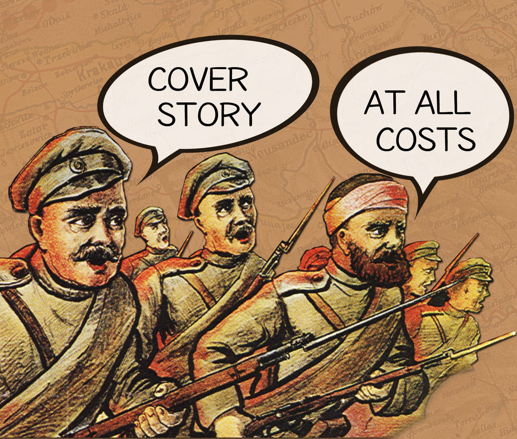
COVER STORY: AT ALL COSTS (by Tom Russell)

Early in 2017, we agreed to publish Tim Taylor's At All Costs, a sequel to their To The Last Man, hoping to release it later that year. As it's now 2020 and we're about a month away from publication, it's taken a bit longer than that. Partially this was about giving Tim the time needed to finalize the design, partially this was about giving us the time we needed to playtest. Our implementation of the game involves printing directly on some specialty wood bits, and so we had to spend some time experimenting with that, in addition to the usual...
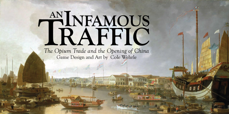
FROM THE ARCHIVES: COVER STORY: AN INFAMOUS TRAFFIC (by Cole Wehrle)

The design of An Infamous Traffic’s cover began with a surprisingly rejection. Mary and Tom had both loved the design of the game. They had loved the look of my playtesting counters, and they had loved the map. They did not, however, liked the cover. What more could they want?! This cover had everything. It had fancy typography and it had a pretty painting. What historical game box could want more? Well, it turns out that they both had strong opinions about covers. Wargame cover design over the past fifteen years or so has followed the Rodger B. MacGowan school...
FROM THE ARCHIVES: COVER STORY: TABLE BATTLES (by Tom Russell)

With any cover design that I do, I try to find the simplest and boldest way to represent the game and its theme. Sometimes I succeed - Supply Lines seems to pull this off rather well, as does the cover for the forthcoming Wars of Marcus Aurelius. But Table Battles isn't about a specific battle, personage, or era. It is, instead, about everything. The base set covers some four hundred years of warfare, bridging between the late Medieval period and the American Revolutionary War, but expansions will go back into the days of Alexander and leap forward into the twentieth...
