Hollandazed: Thoughts, Ideas, and Miscellany — cover design
BOX COVERS (by Tom Russell)

There was a game that was published several years ago that had a very good box cover - distinctive, memorable, something special - that is being republished with a very… well, it's not a bad cover but neither could I call it a good one; it's just kinda there, polished and skillful and utterly uninteresting. I'm not going to tell you what the game is - heck, if you're reading this, there's a good chance you know what the game is. I'm also not going to say that I don't understand the decision. First of all, it's quite possible that...
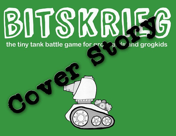
FROM THE ARCHIVES: COVER STORY BITSKRIEG (by Tom Russell)

I was initially at a loss as to what kind of cover to do for Bitskrieg. Because one of the game's big selling points is that you can just as easily play it with a smart child as you can with a fellow adult-person, I knew I wanted something that would appeal to children. I knew what I didn't want, which was the "title done in a childish scrawl with random letters written backwards", because kids can smell that kind of baloney a mile away. I didn't want to be phony. I wanted something that was genuine, and would genuinely...
COVER STORY: THIS GUILTY LAND (by Tom Russell)

We'll be releasing This Guilty Land later this month. The very first version of the cover went public well over a year ago. We don't usually do it that far ahead of the game's release. But given the scope of the project, and the sensitivity of its subject matter, there were a number of reasons why I would have wanted to give up and step away from the project, and announcing it that early in the development process essentially forced me to commit to it. It was important to me in designing a cover that it not tip-toe around the...
COVER STORY: BITSKRIEG (by Tom Russell)

I was initially at a loss as to what kind of cover to do for Bitskrieg. Because one of the game's big selling points is that you can just as easily play it with a smart child as you can with a fellow adult-person, I knew I wanted something that would appeal to children. I knew what I didn't want, which was the "title done in a childish scrawl with random letters written backwards", because kids can smell that kind of baloney a mile away. I didn't want to be phony. I wanted something that was genuine, and would genuinely...
COVER STORY: TABLE BATTLES (by Tom Russell)

With any cover design that I do, I try to find the simplest and boldest way to represent the game and its theme. Sometimes I succeed - Supply Lines seems to pull this off rather well, as does the cover for the forthcoming Wars of Marcus Aurelius. But Table Battles isn't about a specific battle, personage, or era. It is, instead, about everything. The base set covers some four hundred years of warfare, bridging between the late Medieval period and the American Revolutionary War, but expansions will go back into the days of Alexander and leap forward into the twentieth...
