Hollandazed: Thoughts, Ideas, and Miscellany — graphic design
FROM THE ARCHIVES: COUNTERFACTUAL: ANTONY AND CLEOPATRA (by Tom Russell)
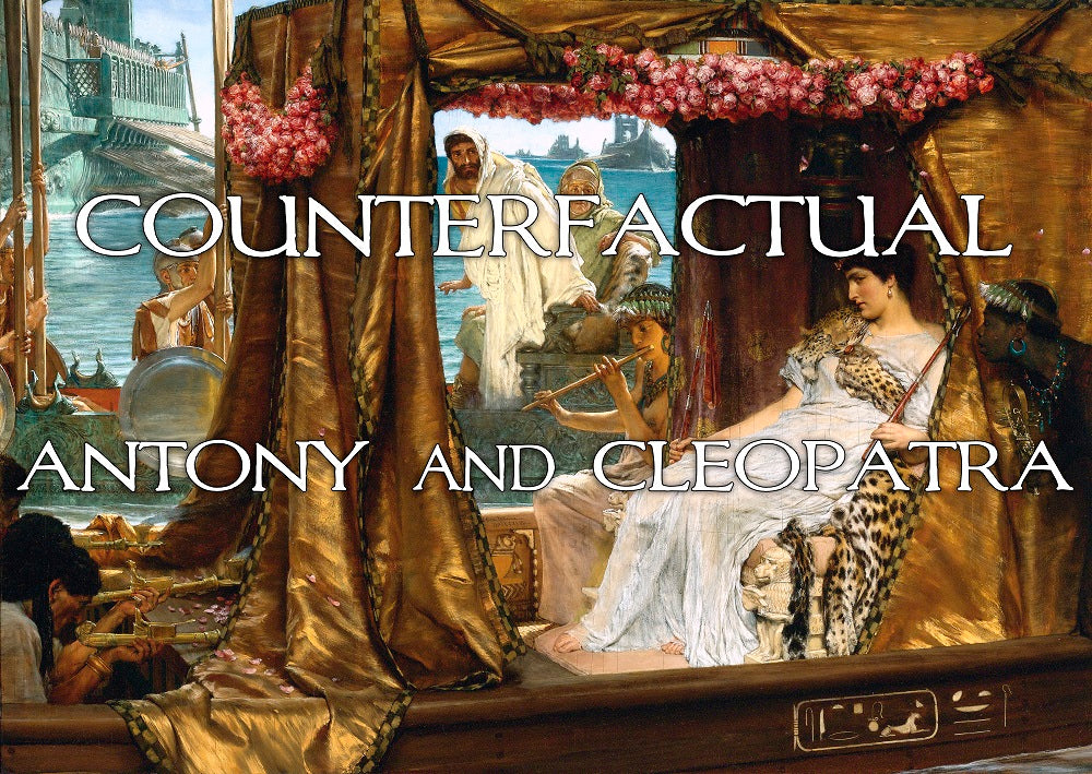
Last year, we purchased a Wacom Tablet, which is a little pad with a little pen-type thing that plugs into your computer and lets you draw on it. As you probably know, I do the graphic design for almost all of our covers, and the layout for almost all of our counters, and I was starting to feel the limitations of what I could accomplish in those spheres with a mouse and the shapes tool in my ten year old version of Photoshop. The idea was that getting the Wacom might allow me to do things that were slightly more...
FROM THE ARCHIVES: COVERS, COUNTERS, AND CARDS (by Tom Russell)
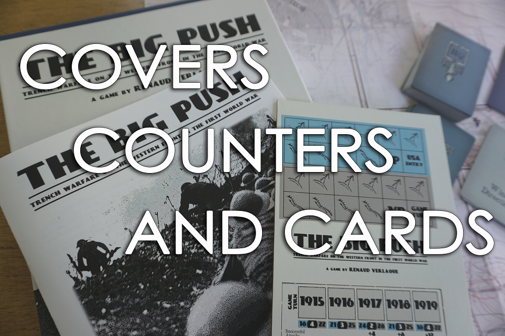
As most folks know by now, we publish games using a print-on-demand model. This means that when you buy a game, we take the money that you gave us and from that we pay our printer and set aside money for royalties. We don't pay a cent before then, and this allows us to publish a larger number of games, and to sometimes publish games that are aggressively unusual or uncommercial. Okay, so that isn't exactly one hundred percent true. For one thing, wood bits and cards - which are becoming increasingly prominent in our games - have to be...
FIVE-EIGHTHS (by Tom Russell)
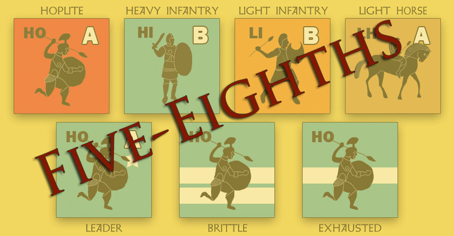
For most projects, I have a square canvas that measures five-eighths of an inch. That's already small, but it gets smaller: even when you cut counters with a laser, there is still some slight variation. To protect against that, I have to keep the functional text and illustrations roughly 1.2 millimeters away from the margins. What I'm left with, then, is a fraction over half an inch - about 0.53" to be more precise. The first thing that tiny little square needs to do is communicate. It'd be nice if it was also pretty - I want it to be...
COUNTERFACTUAL ANTONY AND CLEOPATRA (by Tom Russell)

Last year, we purchased a Wacom Tablet, which is a little pad with a little pen-type thing that plugs into your computer and lets you draw on it. As you probably know, I do the graphic design for almost all of our covers, and the layout for almost all of our counters, and I was starting to feel the limitations of what I could accomplish in those spheres with a mouse and the shapes tool in my ten year old version of Photoshop. The idea was that getting the Wacom might allow me to do things that were slightly more...
FROM THE ARCHIVES: COVER STORY BITSKRIEG (by Tom Russell)
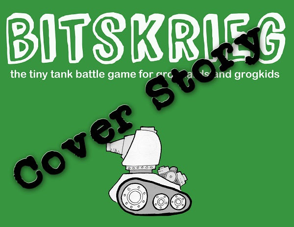
I was initially at a loss as to what kind of cover to do for Bitskrieg. Because one of the game's big selling points is that you can just as easily play it with a smart child as you can with a fellow adult-person, I knew I wanted something that would appeal to children. I knew what I didn't want, which was the "title done in a childish scrawl with random letters written backwards", because kids can smell that kind of baloney a mile away. I didn't want to be phony. I wanted something that was genuine, and would genuinely...
- 1
- 2