
Last year, we purchased a Wacom Tablet, which is a little pad with a little pen-type thing that plugs into your computer and lets you draw on it. As you probably know, I do the graphic design for almost all of our covers, and the layout for almost all of our counters, and I was starting to feel the limitations of what I could accomplish in those spheres with a mouse and the shapes tool in my ten year old version of Photoshop. The idea was that getting the Wacom might allow me to do things that were slightly more elegant than a rectangle with rounded corners. And that more-or-less has proven to be a sound investment; there's no way I could have done the snake on the cover of Antony and Cleopatra without it.

For Mr. Theissen's previous Hollandspiele games, set as they were in the Napoleonic era and the ACW, I could and did represent the various combatants with solid, sturdy, dependable NATO symbols, but that seemed super-inappropriate for the contest between Octavian and Antony. Usually when this is the case, we end up having to hire an illustrator, shelling out a decent amount of cash for each counter illustration.
With five unit types and four leader illustrations, that kind of things adds up fairly quickly. There's a reason why the Legionary Battle Units and Settlements in Agricola, Master of Britain look an awful lot like the Legions and Forts in Wars of Marcus Aurelius, and that was because it reduced the number of new illustrations we needed for WOMA by two.
A general tendency toward penny-pinching, the smell of a fresh Wacom, and a third ingredient - a clear sense of how I wanted the counters to look, and my gut feeling that I'd be unable to communicate that effectively to an artist - resulted in me trying my hand at it myself. I reused the aquila I had made for Agricola, but the rest was drawn by hand by way of the Wacom. I used white and black silhouettes to differentiate between types of similar units, while making drawings of some famous busts of the dramatis personae. I thought it was simple to parse and rather elegant, and so I threw some combat and movement factors on the counter and voila, I had my playtest copy:
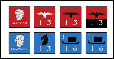
As you can see, for Experienced Legions, which had some extra benefits, I used a black bar behind the numbers to differentiate them. Something bugged me about the counters as a whole, though. Once I had added the numbers, it detracted from the clean, stark, appealing look I had labored toward. I had put them on the counter as a matter of course, just following convention. All the units represented a single strength point, so the number on the left of the counter was always "1". Maybe I didn't really need that number on there at all? And since movement rates were standardized within unit types - land units, naval units, and naval transports - maybe I didn't need that number, either. I tried it without the numbers and I found I liked that a lot better:

Mary agreed, and we sent the counters to John. I will admit that I was a little nervous at first. It's not that I thought that John wouldn't like them; it's that I just didn't know one way or the other. Though this is the fifth game we've worked on together, we haven't really stopped to talk about the aesthetics of counter design. Other hex-and-counter designers I know are sometimes very traditional, so I wasn't sure how John would feel about counters without any factors on them. I was delighted when John wrote back to say that we were speaking the same language; he loved them.
So do I. In fact, right now I think they're the best counters I've ever done.