Hollandazed: Thoughts, Ideas, and Miscellany — counters
FROM THE ARCHIVES: COUNTERFACTUAL: ANTONY AND CLEOPATRA (by Tom Russell)
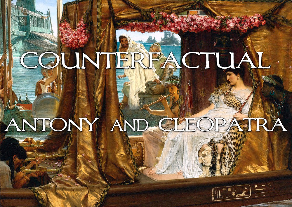
Last year, we purchased a Wacom Tablet, which is a little pad with a little pen-type thing that plugs into your computer and lets you draw on it. As you probably know, I do the graphic design for almost all of our covers, and the layout for almost all of our counters, and I was starting to feel the limitations of what I could accomplish in those spheres with a mouse and the shapes tool in my ten year old version of Photoshop. The idea was that getting the Wacom might allow me to do things that were slightly more...
COUNTERFACTUAL ANTONY AND CLEOPATRA (by Tom Russell)

Last year, we purchased a Wacom Tablet, which is a little pad with a little pen-type thing that plugs into your computer and lets you draw on it. As you probably know, I do the graphic design for almost all of our covers, and the layout for almost all of our counters, and I was starting to feel the limitations of what I could accomplish in those spheres with a mouse and the shapes tool in my ten year old version of Photoshop. The idea was that getting the Wacom might allow me to do things that were slightly more...
COUNTERFACTUAL: BRAVE LITTLE BELGIUM (by Tom Russell)
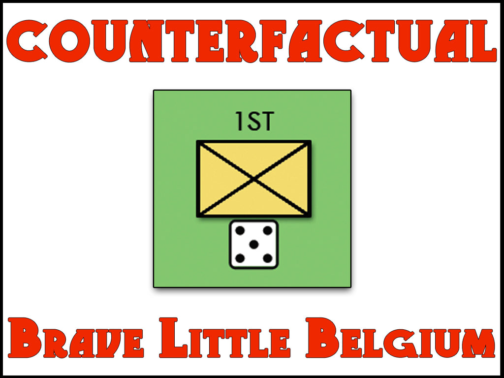
The first time we got Brave Little Belgium on the table, I was convinced that Ryan and Dave had created something really special, something that had a considerable amount of crossover appeal. And we wanted to capitalize on that in the way the game was presented - the box cover, the map, the rulebook, and the counters all needed to be clean and inviting. Ryan's prototype counters used photographs of infantry and cavalry soldiers, and I originally experimented with doing something in the same vein. But I just didn't find my efforts to be particularly compelling - it didn't "pop"...
COUNTERFACTUAL: BLOOD IN THE FOG (by Tom Russell)
People who don't know us well don't realize how utterly I depend on Mary, and how utterly hopeless I would be without her. It's not just that she keeps me centered, or focused, or that she brings out the best in me, though she does indeed do all of those things. It's not just that she keeps me safe from harm as I wander, Magoo-like, oblivious to the world around me and lacking anything resembling common sense. Though she does that too. Really, there are a thousand-thousand ways she makes my world go 'round, but the thing I'm talking about...
COUNTERFACTUAL: TEUTONS (by Tom Russell)
Teutons!: Assaults on the West, 1870-1940 collects three Lou Coatney designs (one each about the Franco-Prussian War and the two World Wars) in a single package. The major aim of the counter design was to clearly differentiate the counters for each game from each other, while maintaining a consistent style. Usually when you have multiple games in a set, or multiple battles each with its own set of counters, they're differentiated by some kind of small letter code or symbol printed on the counter. I'm not a big fan of that, actually, and wanted to find a more overt way...
- 1
- 2