As I've mentioned more than once, Mary is amazing. One of the reasons why she's amazing is that she stops me from doing dumb things. Don't quote me on this, but I'm pretty sure she once had to legitimately stop me from putting aluminum foil in the microwave, and also from wearing Velcro shoes to a professional interview. Recently I thought it was a smart idea to put fennel in twice-baked potatoes, and learned that it wasn't such a smart idea after all when we were eating said potatoes, and also two, three, and four hours later during repeated visits to the necessary, and the only reason Mary didn't stop me from putting fennel in the potatoes is that she didn't know that I was doing it. Seriously, folks, I'm pretty sure if she left me unsupervised for more than an hour that I'd end up with a cookie jar stuck on my head, never mind the fact that we don't own a cookie jar.
One of the ways Mary works this particular magic is when I get her input on the cover designs I do for Hollandspiele. When we first agreed to publish John Theissen's More Aggressive Attitudes, I immediately had an idea for the core bits of the cover concept:
(1) Parallel black lines breaking up pieces of photos into irregularly-sized sections.
(2) The title on three of those black lines in white text: MORE (left-justified) AGGRESSIVE (centered) ATTITUDES (right-justified).
(3) Photos of the two major commanders, Pope and Lee.
I wasn't quite satisfied with the result. There was something off about it, but I figured with more fiddling, I could find the right balance. I showed it to Mary to ascertain that I was at least on the right track.
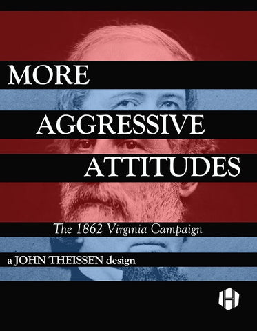
I was most assuredly not on the right track. I was nowhere near the right track. I think Mary's reaction was something like, "You're kidding, right? This must be bad on purpose."
And so I went back to the drawing board (or the Adobe suite, as the case may be). Mary liked the eyes but little else, and nudged me toward using some other images to fill up the rest of the cover. This I did, and it was good enough that Mary sent it along to John Theissen.
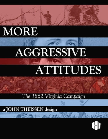
John liked it, but suggested that we use just one picture below "Attitudes", splitting that one into three parts. This resulted in the next iteration, which I thought for sure was the final one.
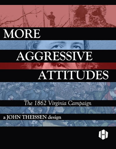
The cover stayed that way for quite some time. But Mary felt that something was off about it, and once we got our proof copy, she was able to put her finger on it. The title "stair-stepped" from left to right, while the subtitle and designer credit "stair-stepped" in the opposite direction. That fought the design, and that was exacerbated by the left-to-right movement of the troops in the bottom visual element.
Mary suggested that the last two bits mimic the same movement as the rest of the title.

As is often the case, she was right.