Hollandazed: Thoughts, Ideas, and Miscellany

(RE)MAKING SHIELDS & SWORDS, PART TWO: THE SYSTEM (by Tom Russell)

(RE)MAKING SHIELDS & SWORDS, PART TWO: THE SYSTEM (by Tom Russell)

"Battle of Grunwald", Jan Matejko, 1878, 426×987cm So, last time I touched on the history of the original Shields & Swords games, how they sold, why the folio series was cancelled, and why it made sense for Mary and I to resurrect it for Hollandspiele as Shields & Swords II. Today, I'm going to explain the mechanics of the system, how it was tweaked by each of the four S&S games, and how S&S II differs from that iteration. The core of the system is that each player has one or more color-coded Wings, with each Wing made up of...


(RE)MAKING SHIELDS & SWORDS, PART ONE: BIDNESS (by Tom Russell)

(RE)MAKING SHIELDS & SWORDS, PART ONE: BIDNESS (by Tom Russell)


COVER STORY: THE GRUNWALD SWORDS (by Tom Russell)

COVER STORY: THE GRUNWALD SWORDS (by Tom Russell)

The Grunwald Swords cover was certainly the easiest one that I ever did, as it went through the fewest iterations. Usually what happens is I'll have an idea for the cover, I'll block it out, and then find that I don't like it. So I'll scrap it for something else that I'll be happy with. Then I show it to Mary, who will give it the yay or the nay. Sometimes this results in me going at it again from scratch. And so on, until I end up with a cover that's half-way presentable. But with this one, I had...


COUNTERFACTUAL - THE SCHELDT CAMPAIGN (by Tom Russell)

COUNTERFACTUAL - THE SCHELDT CAMPAIGN (by Tom Russell)

When Mary and I started talking about the feasibility of publishing games ourselves, one of the prime topics of discussion was how to keep down the costs of the artwork, while still paying our artists a rate that we felt was equitable and fair for their labor and talent - a tricky balance, to be sure. I know when I was developing pack-in games for Yaah! magazine that I had to adhere to a pretty strict art budget. One artist completed his work for a few hundred bucks at a hefty discount as a favor to me and to Mark....


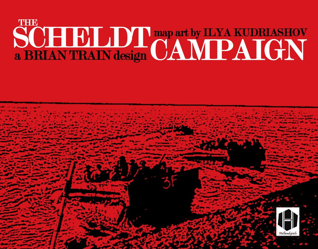
COVER STORY: THE SCHELDT CAMPAIGN (by Tom Russell)

COVER STORY: THE SCHELDT CAMPAIGN (by Tom Russell)

It starts with color, and typography. Whenever I do a box cover, I tend to limit my palette to two or three very stark, bold, direct colors. For The Scheldt Campaign, I started with a bright, rich red (d8161e). This would be the color that dominated the canvas. I then decided to use white as my primary text color. It's clean and reads well on red, without the need for any outline, shading, or drop. I'm not afraid of using those elements when I need to, but I prefer to stay away from then when I can. It gives the...