Hollandazed: Thoughts, Ideas, and Miscellany — WWII
COUNTERFACTUAL - THE SCHELDT CAMPAIGN (by Tom Russell)
When Mary and I started talking about the feasibility of publishing games ourselves, one of the prime topics of discussion was how to keep down the costs of the artwork, while still paying our artists a rate that we felt was equitable and fair for their labor and talent - a tricky balance, to be sure. I know when I was developing pack-in games for Yaah! magazine that I had to adhere to a pretty strict art budget. One artist completed his work for a few hundred bucks at a hefty discount as a favor to me and to Mark....
COVER STORY: THE SCHELDT CAMPAIGN (by Tom Russell)
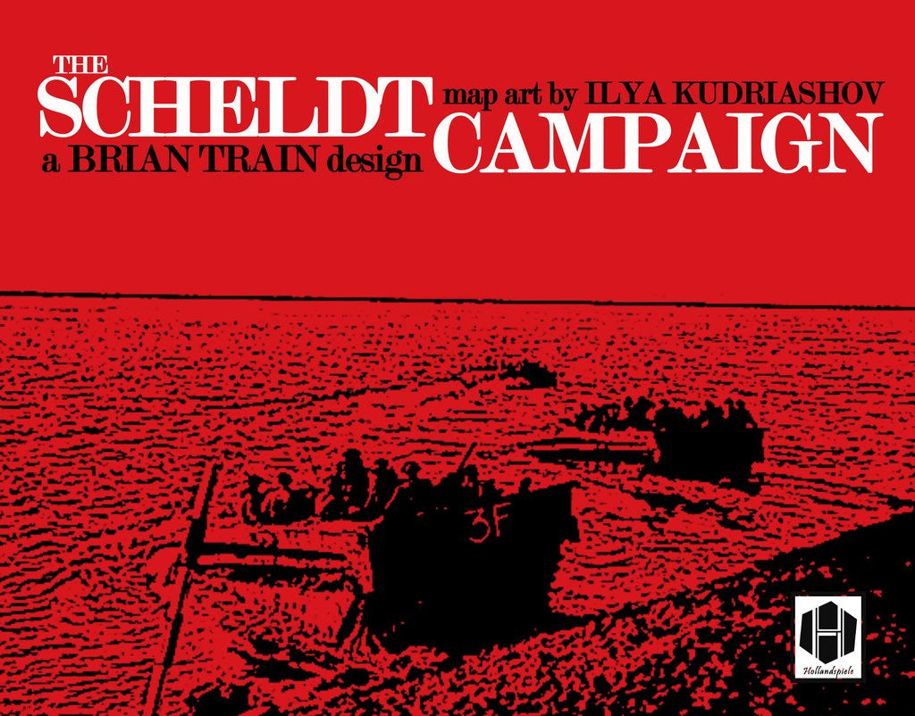
It starts with color, and typography. Whenever I do a box cover, I tend to limit my palette to two or three very stark, bold, direct colors. For The Scheldt Campaign, I started with a bright, rich red (d8161e). This would be the color that dominated the canvas. I then decided to use white as my primary text color. It's clean and reads well on red, without the need for any outline, shading, or drop. I'm not afraid of using those elements when I need to, but I prefer to stay away from then when I can. It gives the...
DESIGNER'S NOTES: THE SCHELDT CAMPAIGN (by Brian Train)

In his book The Complete Wargames Handbook, the noted wargame designer James F. Dunnigan had two basic rules for aspiring designers: Keep it simple. Plagiarize. Later he euphemized the second one as “use available techniques”, but still, these are words to live by. And once in a while a game system comes along so loaded with good ideas and potential directions it simply has to be used! Giving due credit to the original thinker, of course… we do stand on the shoulders of giants, and they all have names. In the particular case of The Scheldt Campaign,...
- 1
- 2