
People who don't know us well don't realize how utterly I depend on Mary, and how utterly hopeless I would be without her. It's not just that she keeps me centered, or focused, or that she brings out the best in me, though she does indeed do all of those things. It's not just that she keeps me safe from harm as I wander, Magoo-like, oblivious to the world around me and lacking anything resembling common sense. Though she does that too.
Really, there are a thousand-thousand ways she makes my world go 'round, but the thing I'm talking about today is the fact that I trust in, and rely on, her judgment. Mary looks at things differently than I do, but there's enough overlap in our interests and tastes that most of the time, we're looking at the same thing, we're just approaching it from a different angle and seeing things the other doesn't.
Mary is much more thoughtful than I am, weighing pros and cons and experimenting with the results, while I tend to make snap decisions, "going with my gut". I will try the first thing that comes to mind and so long as it works and feels right, I don't try a second thing. Here's the weird thing, though: I am absurdly hyperverbal and prone to over-analysis for someone who makes decisions "instinctually". And as far as graphic design goes, I don't have a natural, instinctual color sense, or an aptitude for weight and placement. Mary, on the other hand, has a very well-developed design sensibility. Color sense, shape, balance, all this comes quite naturally to her. She can look at something and tell me immediately that something feels wrong. She might not always be able to articulate what it is precisely that's "off", but when she says something's wrong, ninety-nine times out of a hundred, something is wrong. I might not be able to see it, and sometimes it leaves me scratching my head, but like I said, I trust her eye. When something flunks the Mary Test, I go back to the drawing board.
What this has to do with Blood in the Fog is that I flunked the Mary test repeatedly.
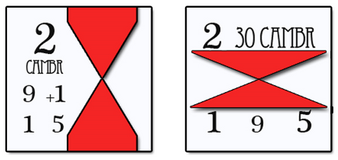
So, to start with, I wanted to do something different and distinctive with the counters. I began by abstracting and distorting standard symbols and experimenting with negative space. The first attempt (left image below) took this a little too far and resembled an hourglass more than any kind of identifiable unit symbol. The second (right image below) walked back from this a bit, made it a bit more recognizable, but Mary thought it still felt too much like an hourglass.

Looking at it now, the red superscript for the Fire Bonus makes my eyes bleed. In the left image, the Fire Bonus is represented by the yellow dot in the upper-right corner. Really, this was the biggest problem with Blood in the Fog: the sheer amount of information on the counters. You have your "Plus Steps" number, your range, your Fire Bonus, your Movement, your Division, the Unit symbol, the Unit's name. Some Units also have a Marksmen Bonus, a Charging Bonus, or a Skirmish ability. "You have too many numbers," Mary said, and she was right, but what could I do? I was really struggling to find a way to represent all of this information cleanly, and would continue to struggle until I did away with the "Plus Steps" number; since this number only really factored into play during Set-Up or on the turn of entry, I could just squirrel this away in the rulebook where it wouldn't hurt anyone.
But I didn't have that realization yet, and before I got there, I created the single ugliest counter I've ever designed. It was so bad, that I'm really kind of embarrassed to be showing it to you now. It is the source of my deepest, darkest shame. That Unit symbol especially looks like I had just discovered Photoshop's blending options and had gone mad with power.

My next two attempts resurrected the negative space theme, but in a slightly different way, using the background color to define the "flanks" of the Infantry X. Mary, does this still look too much like an hourglass? Yes, it still looks too much like an hourglass.

At this point it felt like maybe I was trying too hard to be "different" or "distinctive". After all, the most important thing a counter has to do is communicate. There's a reason why combat factors tend to be on the left, and movement factors on the right, why Unit symbols are either centered or center-right justified, and why you should never use Bauhaus font for unit factors.
So, on my... let's see, eighth attempt, I decided to stop trying to reinvent the wheel. The resulting counter (left image below, natch) looked cluttered and kinda blah, and that superscript especially just wasn't working. Also, the font I used to identify the unit wasn't right for the period, as Mary pointed out. It needed something, but it didn't need that something to be aggressively weird or different. On my next attempt (right image below), I tried using a horizontal band to divide the counter into three parts. I also brought back the little yellow dot in place of the Fire Bonus super-script.

This worked a little better, and I especially liked the way the Unit symbol turned out. But it was still kinda cluttery (this is totally a technical term), and the black-with-white-highlights for the factors is probably one of the seven deadly sins of counter design. At any rate, Mary felt the ninth attempt as a whole was a step in the right direction, with that simple, straightforward band in the middle giving it that little bit of flair it was needing.
My final counter design built on its immediate predecessor. At this point, I finally realized that I could remove the Plus Steps number, which meant I could plug the Fire Bonus - previously relegated to a little dot or an illegible superscript - in the left-most factor spot. I used a hex around the range to set it apart from the other two factors, and to remind the players what the number was for. I also took the white band and made it off-white to soften it a bit.

It's weird; I've done counters for over a half-dozen different games now, and none of them gave me quite the trouble that this one did. But the tenth iteration is absolutely, I would even say objectively, better than any of its predecessors. And here's the thing: if not for Mary, the game would have went to press with that very first design. Or if not that one, the second, or the third. Like I said up-top, when I do counters or box-tops or anything "graphic design-y", I have a tendency to make snap decisions and if they "work", I don't go back and second-guess myself. Some part of my dim, reptilian brain thought that each of those first ten versions "worked", when clearly and in fact they didn't. Mary was able to see that, and we all have her to thank for the fact that I didn't subject our customers to those monstrosities.
(Thanks, pookie.)